Previously, we’ve looked at what a well-written CV should include. Today, we’re focusing on how to format a CV or resume. After all, a CV needs to look professional, so its formatting is almost as important as its content. And with that in mind, our top tips for formatting a CV include:
- Work out what kind of CV or resume you need to prepare.
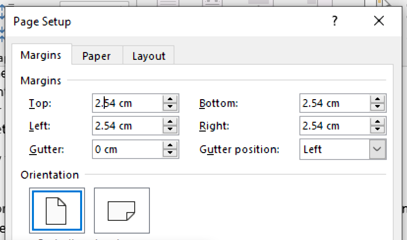
- Adjust the margins on your document to use space effectively.
- Pick a font that is easy to read and apply it consistently.
- Use clear headings to separate different sections of your CV.
- Use bullet points, italics and bold fonts to aid skim readers.
For more on how to format a CV or resume, check out our tips below.
1. Different Types of CV/Resume
The type of CV or resume you pick will affect its presentation. As such, it’s important to know the differences between the main types of CV:
- Chronological – A chronological CV is one that lists your work/educational experience in reverse chronological order. Usually, this will come straight after the contact information and your personal statement. This format is most useful when you have relevant experience or qualifications that you want to emphasise on the first page of a CV.
- Functional – A skills-based or functional CV focuses on your skills and experience. Usually, these CVs are organised by theme rather than by listing roles, with sections headed ‘Marketing Skills’, ‘Customer Service Experience’, etc. This format is most useful for those who have a gap in their employment history or people who are looking to change careers.
- Combination – A combination resume is like a functional resume, with an emphasis on skills grouped by theme. However, it should also include a chronological history of your previous work and roles.
In addition, some people distinguish between a CV (i.e. a full account of your professional history) and a resume (i.e. a one- or two-page summary of your career and skills). This is more common in the USA than in the UK, but it’s worth checking so you know how much information to provide.
Now, though, let’s move on to the nitty-gritty of how to format a CV.
2. Check Your Margins
You may not usually give much thought to the margins in a document. But when you need to fit a lot of information into a limited space, without sacrificing clarity, they can make a difference.
Ideally, then, the margins of your CV or resume should be around 2.54cm (one inch) on all sides. If you need to save space, you can reduce this to a minimum of 1.25cm (half an inch) on all sides. Make sure to leave some space in the margin, though, as otherwise your CV will look cramped.

3. Picking a Font
There are several fonts you could use in a CV or resume. Any font you use, though, should meet two requirements:
Find this useful?
Subscribe to our newsletter and get writing tips from our editors straight to your inbox.
- Easy to read both on screen and when printed out on paper.
- A standard font that will work on any computer.
Typically, the best fonts are the ‘boring’ ones everyone uses (e.g. Calibri, Arial, Times New Roman). But whatever you do, don’t write a CV using Comic Sans if you want it to look professional. The best font size, meanwhile, may depend on the font you’ve chosen. But 10-12pt is a good guideline.
4. Using Headings Effectively
A good CV or resume will be divided into several sections (e.g. Contact Information, Skills, Work Experience). And to make the structure clear, each section should begin with its own heading.
To ensure these headings stand out, you may want to use a slightly larger font and/or bold formatting. But however you format the headings in your CV, make sure to apply one style consistently for each heading type.
5. Make Your CV Easy to Skim Read
As well as adding headings, there are a few things you can do to make your CV easier to skim read. These include the following:
- Use bold and italic fonts for key information. It also helps to use different types of emphasis for different things (e.g. bold for job titles, italics for the firms you worked at). Make sure to apply this formatting consistently.
- Write numbers as numerals rather than words to help key stats stand out.
- Use bullet pointed lists to provide details about past roles and education.
- Align most text to the left margin, but use right alignment to separate out certain details (e.g. start and end dates) so they’re easier to read.
- Leave some white space so the text doesn’t look too cramped.
This can make a big difference to readability. And as recruiters may have to read hundreds of CVs every day, this can be important.
CV and Resume Proofreading
Finally, once you’ve formatted your CV or resume, don’t forget to have it proofread. Any errors could cost you your dream job, as typos may suggest a lack of attention to detail, so a little proofreading can go a long way.


