When presenting data in an essay, tables and charts provide a visually striking way of communicating important information. And Microsoft Word makes adding tables and charts to a document pleasingly simple, as we shall now explain.
Inserting a Table
Microsoft Word (2007 and later) gives you three main options for adding custom tables to a document. All you need to do is one of the following:
- Go to the ‘Insert’ tab, click the ‘Table’ option, and pick the number of columns and rows required from the grid that appears
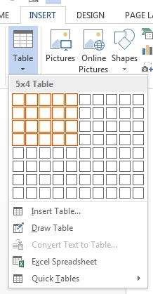
Adding a table. - In the same menu, click ‘Insert Table’ and enter the number of columns and rows in the pop-up window that opens
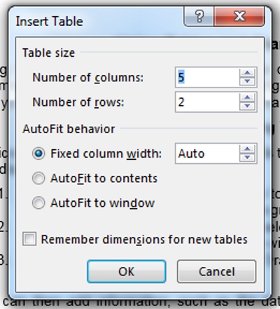
Table options. - Use the ‘Draw Table’ tool in the ‘Table’ menu to add and edit tables with the mouse
You can also select one of Word’s built-in tables from the ‘Quick Tables’ menu here, but make sure the one you pick suits your requirements if you do take this route.
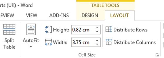
Once a table has been inserted, you can add information as required. You can also edit existing tables by clicking on them and using the ‘Table Tools’ options on the main ribbon.
Inserting a Chart
Word lets you add a wide variety of chart types to a document depending on your needs, ranging from simple line, bar and pie charts to 3D area and radar charts (with a bunch more recently added in Word 2016, in case you really want to get nerdy about presenting data).
Whichever type of chart you need, though, it can be added as follows:
Find this useful?
Subscribe to our newsletter and get writing tips from our editors straight to your inbox.
- Position the cursor where you want your chart to appear and click ‘Chart’ in the ‘Illustrations’ section of the ‘Insert’ tab on the main ribbon
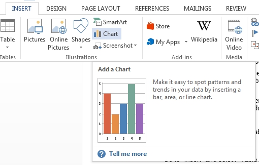
Adding a chart. - In the window that opens, select your preferred chart type from the menu
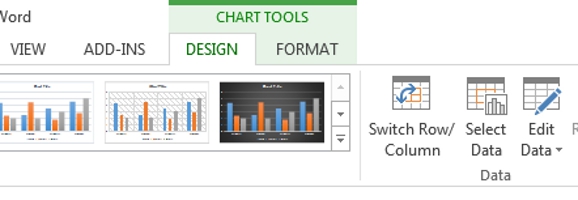
- Add data to your chart by editing the values in the spreadsheet that opens (this can be amended later by clicking the chart and selecting ‘Edit Data’ from the ‘Design’ section of the ‘Chart Tools’ menu)
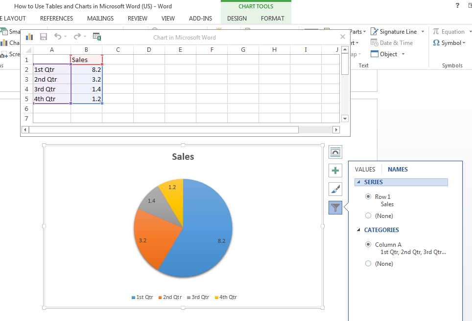
Entering data. - Add a title to your chart by double-clicking ‘Chart Title’ and typing
For even more control, you can fully customise your chart using the buttons that appear when you click on it and via the ‘Chart Tools’ tab on the main ribbon.
Adding Captions to Tables and Charts
In an academic document, it’s also important to label the tables and charts you use. Microsoft Word lets you do this by adding ‘Captions’, with two main methods available:
- Right-clicking your table/chart and selecting ‘Insert Caption’ from the menu
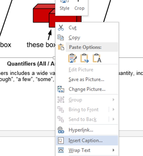
Adding captions via the contextual menu. - Clicking where you want the caption to appear, then selecting ‘Insert Caption’ from the ‘References’ tab on the main ribbon
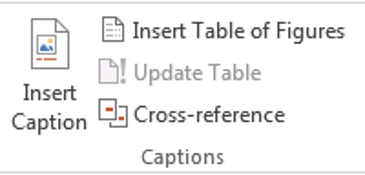
Caption options.
Typically, captions for tables should appear above the table, while captions for charts and other figures appear below the image. Adding captions also allows you to create a dynamic list of charts/tables at the beginning of your document, which can be a great time saver.
Looking for help with adding and editing charts but use Google Docs? We have you covered!


